

Vue password hide/show with Vue Formulate
How to that thing that every website has where you toggle the visibility of the password input, but with Vue Formulate


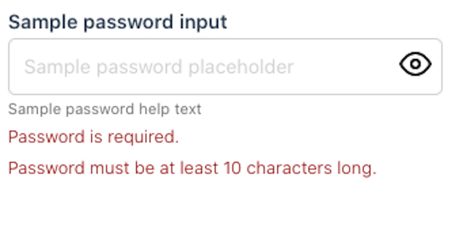
So here it's a preview:
The title tells it all, you are probably not even going to read what I write here, which is fine it means I can have some fun explaining this.
So the first thing we need to learn is how to create a custom input type, and that's pretty simple, just read Vue Formulate Docs.
There you will have an example how to create an autocompete custom input type, as well as registering it.
The most important part is registering the input, as you can see for our input we just import the component directly in the main.js and add it to VueFormulate options object. This works for our demo, but you might want to use a different symtax in production
// main.js
// register your component with Vue
Vue.component("ToggablePassword", ToggablePassword);

Vue.use(VueFormulate, {
  library: {
    "toggable-password": {
      classification: "text",
      component: "ToggablePassword"
    }
  }
});
Or in case you are using nuxt.js you might want to do this in your plugins/ directory like so:
// plugins/vue-formulate.js
import Vue from 'vue'
import VueFormulate from '@braid/vue-formulate'

// register your component with Vue
Vue.component('ToggablePassword', ToggablePassword)

Vue.use(VueFormulate, {
    library: {
        'toggable-password': {
            classification: 'text',
            component: 'ToggablePassword'
        }
    }
});
// nuxt.config.json

export default {
//...
  plugins: ['~/plugins/vue-formulate']
//...
}
This will register our new custom input into the vue-formulate library. For the code input itself is very simple, we need to bind context that is passed down from the Vue Formulate parent into our input, and then just manage the toggle with a local showPassword state.
//ToggablePassword.vue
<template>
  <div
    :class="`formulate-input-element password-field formulate-input-element--${context.type}`"
    :data-type="context.type"
  >
    <input
      :type="showPassword ? 'text' : 'password'"
      v-model="context.model"
      v-bind="context.attributes"
      autocomplete="no"
      @blur="context.blurHandler"
    />
    <button
      type="button"
      @click="showPassword = !showPassword"
      class="icon-button"
    >
      <span class="visually-hidden"
        >{showPassword ? 'Hide password' : 'Show password'}</span
      >
      <div class="icon-eye">
        <img v-show="!showPassword" src="/eye.svg" alt />
        <img v-show="showPassword" src="/eye-off.svg" alt />
      </div>
    </button>
  </div>
</template>

<script>
export default {
  name: "CustomPassword",
  props: {
    context: {
      type: Object,
      required: true,
    },
  },
  data() {
    return {
      showPassword: false
    };
  }
};
</script>

<style scoped>
.visually-hidden {
  clip: rect(0 0 0 0);
  clip-path: inset(50%);
  height: 1px;
  overflow: hidden;
  position: absolute;
  white-space: nowrap;
  width: 1px;
}
</style>
Import in this case to properly add a type="button" as well as having text descriptions inside it, for proper accessibility. Also make sure the icons/images that you use don't have alt attribute, and ideally you might also want to add aria-hidden attribute, so they don't display in screen readers.